Website design for an osteopath and yoga teacher building her practice in Lisbon.
Milene is an Azorean osteopath who built a thriving practice in Faial through one thing: genuine care. Moving to Lisbon meant starting from scratch in a competitive city — without the word-of-mouth network she'd earned over years. The challenge was to create a digital presence that communicated her warmth and expertise to people who had never met her.
The brand needed to feel human, joyful, and trustworthy — not clinical. It also had to serve two different audiences: adults seeking osteopathy and parents looking for gentle care for their children.
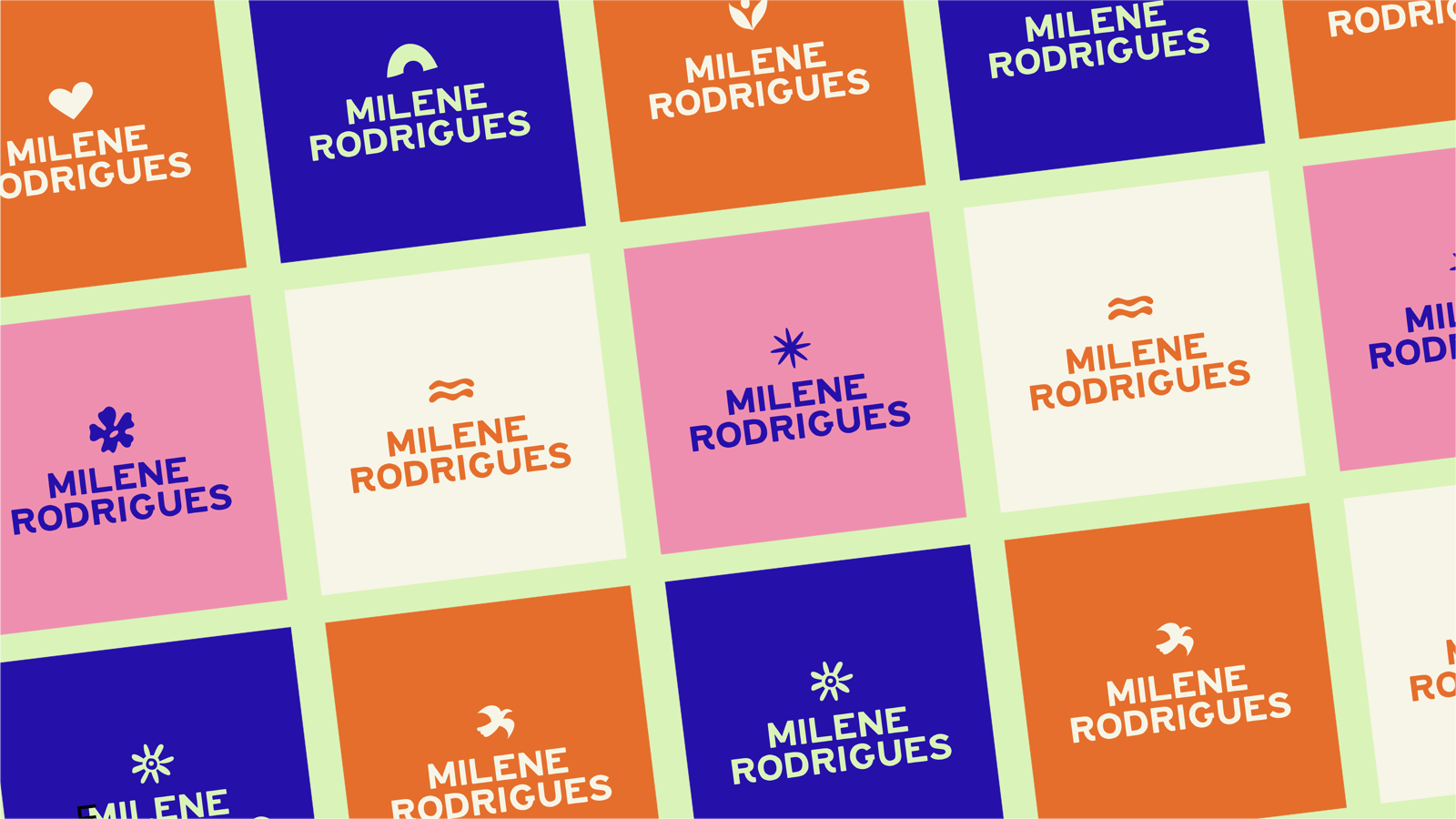
The visual identity centres on a bold, warm colour palette — burnt orange, deep indigo, lime, and rose — that feels alive and approachable without losing credibility. Each colour has a role: orange for energy and warmth, indigo for trust and depth, lime for vitality, pink for care and tenderness.
A custom set of brand icons — flowers, birds, waves, a human-leaf form, a sun — were designed to appear throughout the site as decorative elements that reinforce the holistic, nature-connected philosophy behind Milene's work.
Logo variations
The website was built in Next.js with a section-by-section narrative flow — starting with warmth and trust, moving into Milene's story, then services and testimonials, and ending with a clear call to book. Wave borders between sections create a fluid, organic sense of movement.
Services are broken down clearly: Osteopathy (clinic & home visits), Infant & Pediatric, and Yoga — each with its own tone and visual treatment. The copy was written to feel personal and direct, reflecting how Milene actually speaks to her patients.


This project was a reminder that healthcare brands require a particular kind of sensitivity. Every design decision — colour, type size, tone of voice — either builds or erodes trust. Getting that balance right meant deeply understanding who Milene is before touching a single pixel.
Brands I've worked with