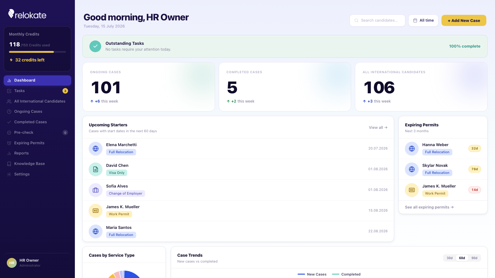
Redesigning the case management platform HR teams use to run global relocation.
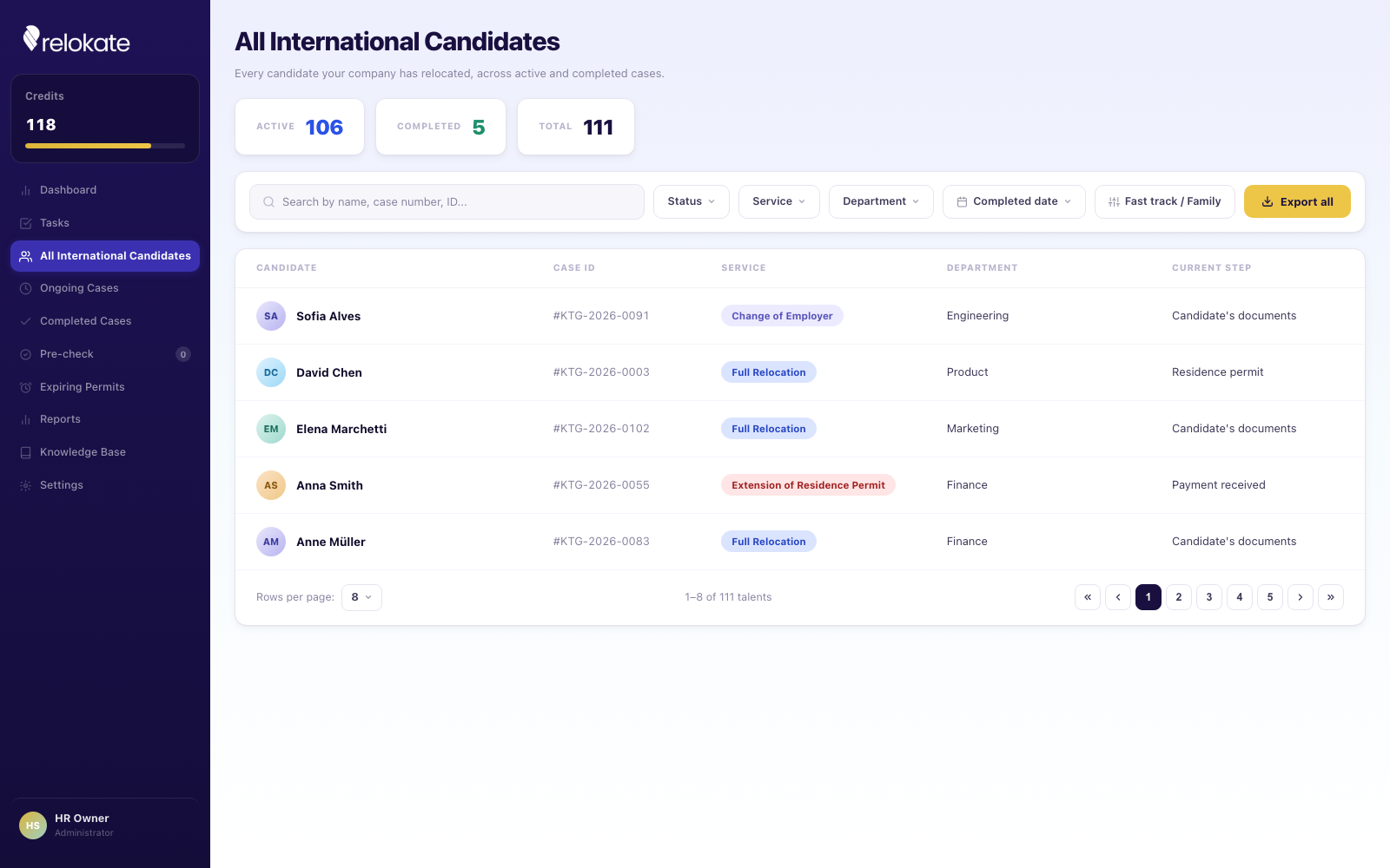
Relokate's HR team tracks every international hire's relocation from a single dashboard — visas, work permits, housing, family moves, degree verifications, all running as parallel cases with their own deadlines. At any given time an HR owner is holding over a hundred active cases, each moving through a different stage. The interface had to make that scale legible: fast to scan, easy to filter, and honest about what needs attention today versus what can wait.
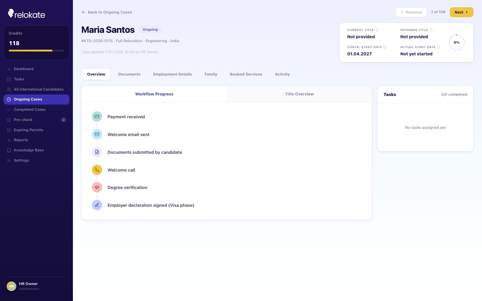
Instead of organizing the product around modules, I structured it around the actual path a case takes — payment received, welcome email sent, documents submitted, degree verified, employer declaration signed. That workflow timeline became the spine of the case detail view, so an HR owner can see exactly where a candidate stands without hunting through tabs.
I also rebuilt the design system from the ground up: sampled the brand's real yellow and navy from existing product screenshots, standardized every service tag, avatar, and status color to a single semantic palette, and unified button and pill radii across all ten screens so the product reads as one coherent system instead of a set of screens shipped at different times.
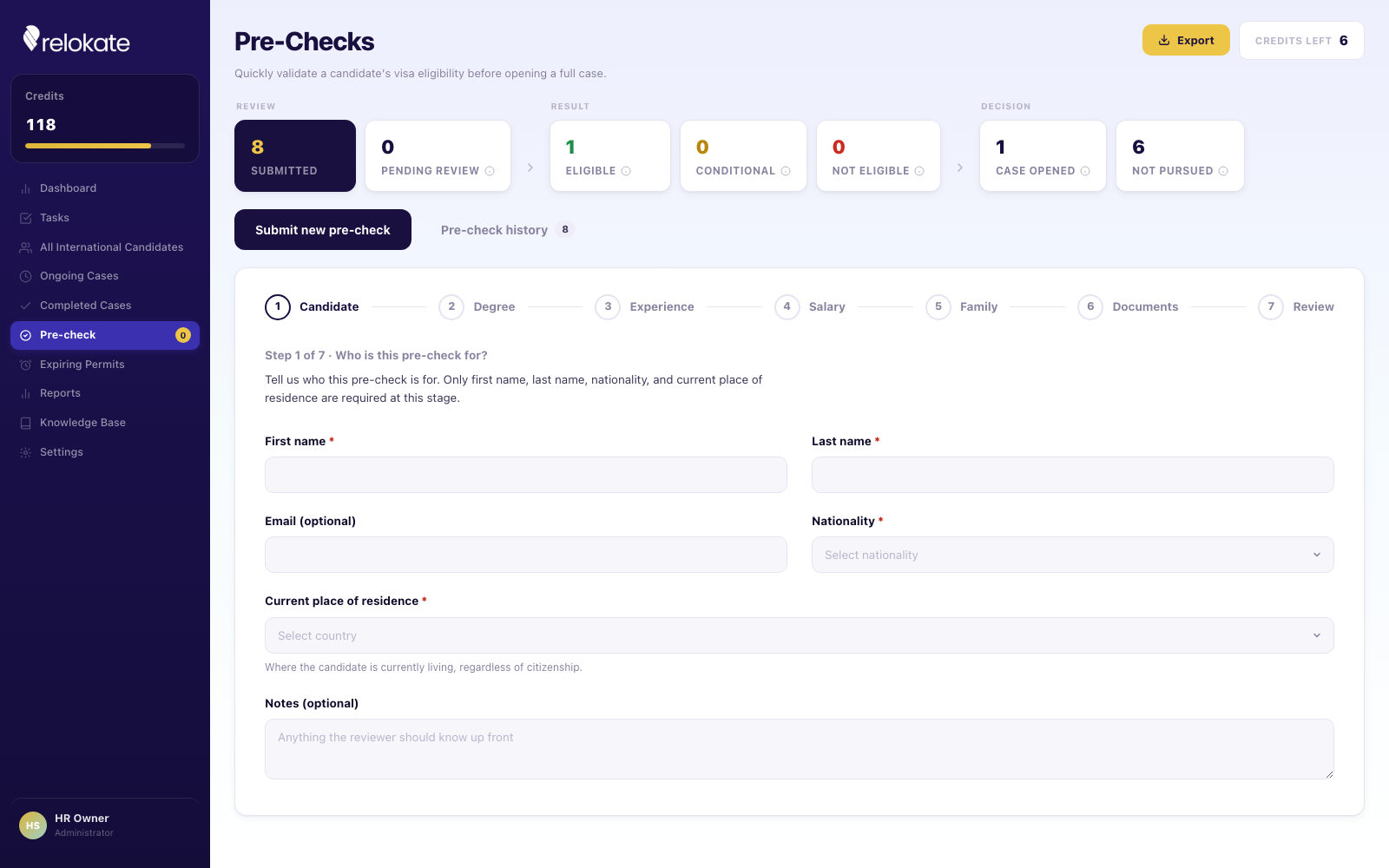
One of the redesign's additions was Pre-Checks — a lightweight, step-by-step eligibility screen HR can run on a candidate before committing the time and cost of opening a full case. It surfaces an eligible / conditional / not-eligible verdict early, so HR teams stop investing hours into relocations that were never going to clear visa requirements.
Brands I've worked with